
Are you overwhelmed by all the Lightroom options? In this ‘How to Edit’ Lightroom tutorial, I will tell you how to use Lightroom. It’s a step-by-step guide AND you get a FREE preset if you use the settings I share in the steps.
First, I’ll tell you a bit more about Lightroom. I made this article specifically for the FREE Lightroom mobile app (download in the App Store or Play Store). If you want, you can directly jump to the tutorial.
I’ve also added a FAQ section below the instruction for some specific questions about editing Lightroom. If you have more questions, feel free to comment below!
What is Lightroom?
Lightroom is an editing software by Adobe. Officially it’s ‘Photoshop Lightroom’ as it has features that Photoshop has, but it’s interference is less complicated.
Lightroom is specifically focused on enhancing a photo with lighting and coloring (so it doesn’t have the option to do layers or anything more complicated that Photoshop has).
How is Lightroom different from other editing apps?
Famous photo editing apps are VSCO and Snapseed. These apps have filters built-in and you can adjust them too. Snapseed is completely free but doesn’t have the option to change colors individually.
VSCO has a free version, but you have to upgrade to the paid version to unlock the HSL (hue, saturation, luminance) tool to change individual colors. That said, VSCO has a wide array of filters built-in and is great if that’s what you want.
Lightroom is a more advanced tool to use for editing. It connects with your devices if you have a Creative Cloud (CC)-subscription and in the free app, you can do all the lighting and coloring you want – without anything holding you back. It’s easy to copy your settings from one photo to another or create a preset if you want to reuse it more times.
I personally love the advanced features that Lightroom has, but I can imagine you’re overwhelmed by all the options. That’s why I’m here to explain how to use Lightroom!
NOTE: there are 3 versions of Lightroom: the Lightroom mobile app, the Lightroom desktop app, and Lightroom Classic for desktop.
What is the difference between the Lightroom mobile app, Lightroom desktop app, and Lightroom Classic?
There are three versions of Lightroom, that can be a little confusing. You can use the Lightroom Mobile app for FREE! For the desktop apps, you NEED a Creative Cloud (CC) subscription. All the lighting and coloring options are available in the free version, and in this Lightroom tutorial, we will focus on all the tools available in the free app.
If you have a CC-subscription, you have a few more options (‘premium options’ basically) for specific and selective editing (like removing people, straightening your photo, and using a brush/radial/gradient to edit parts of a photo).
In addition, any presets you install (or create) will sync automatically between the Lightroom mobile app and desktop app (note: they do not automatically sync to Lightroom Classic).
Different logos
The Lightroom desktop app has a similar interface to the mobile app, and the icon looks the same:
The Lightroom Classic desktop app looks different. depending on your version, the icon looks like the other Lightroom icon but with ‘LrC’ in it. Or it’s an older icon, with sharp corners:
Lightroom Classic also has another interface. You will find all the features you know from the mobile app, but the panels are slightly different. There’s a ‘Basic’ panel with most of the lighting options, but also the white balance, vibrance, and saturation (in the mobile app, you find these in the Color tab).
Lightroom Classic has a few more features than the other apps. Like the panel Camera Calibration. But, I’m not here to make things more complicated, that’s why we focus on the mobile app features and you can find all those features in the Classic desktop app too.
How to use Lightroom? And what is a preset?
That’s the question you’re here for! I’m gonna edit a photo step-by-step and create a preset (basically saving the settings in a ‘filter’ so I can reuse the settings). In the process, you can read and see what each tool does and how it works!
After we created the preset, I’m going to tell you how you can work with presets best – and how to tweak specific colors!
Without further ado, let’s get started with our ‘How to Edit’ Lightroom tutorial! To make it easier, you can also download our free preset and work from there!
Check our installation guide for mobile presets if you don’t know how to add them on Android or iPhone.
Don’t forget to share your creations with #onceuponapreset to get featured!
This will only take: 15 minutes
How to Edit: Lightroom Tutorial
- Launch the Lightroom Mobile app and import a photo
You can import a photo by clicking on the blue ‘add photo’ icon on the bottom right.
Use one of your BEST photos – if the photo looks nice already, it will make editing so much easier. If the lighting is good, you will have to ‘correct’ less in the editing.

- Let’s edit a photo!
You can make your own edit, or follow the next steps to recreate our FREE preset.
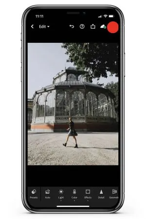
See photos below: before, after preset, and after some extra adjustments.


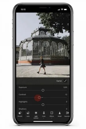
- Edit the lighting in the Light tab.
Lighting varies with the location, the hour, the season – many things! In this tab, you can ‘correct’ a photo if it’s too dark, or too bright. Always try to expose your photos right, it will make editing (and using presets) easier!
For our edit, we’re only going to change the contrast (to -12) and edit the tone curves (top right). Try dragging the sliders to see what they do!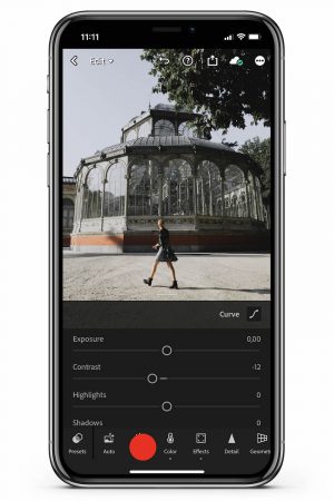

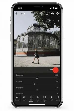
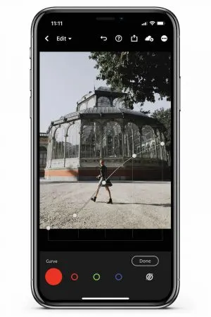
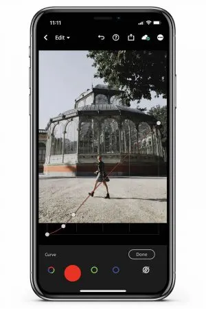
- Adjust the tone curves (top right in the Light tab)
The first curve (RGB curve) is affecting the lighting of all the colors. With this tool, you can increase or decrease (from left to right in the square) the shadows, darks, lights, and highlights.
The other three curves are affecting the specific primary colors: red, green, and blue. With these curves, you can increase or decrease the colors in the shadows, darks, lights, and highlights.
We explain more about the tone curve in the FAQ section below!
For our preset, we use the curve settings from the photos below. Feel free to copy!


- Edit the colors in the Color tab.
This is where it gets really fun! In this tab, you can actually change the colors of your photo.
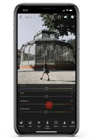
Our presets do not include a certain white balance (WB), so we leave it as ‘as shot’. But maybe your photo’s white balance is not right, and you can move the Temp and Tint sliders. For sunset photos, you can perfectly slide both more to the right to get that warm sunset vibe. But keep in mind; it affects your entire image, so everything will turn more blue/yellow/green/pink!
I set the Vibrance to +11 and Saturation to -2 for this edit.

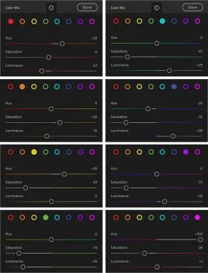
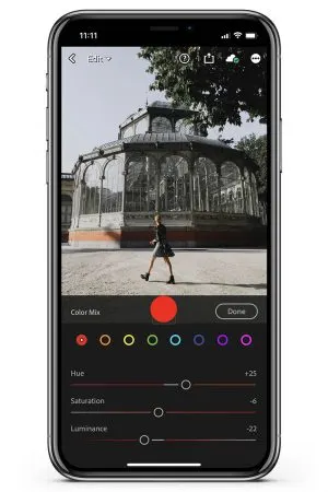
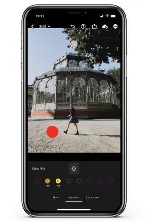
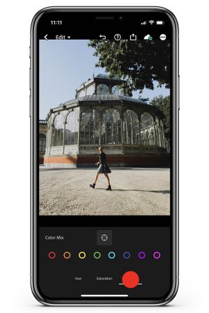
- Change colors, click on Mix (top right in Color tab)
Here, you can change 1 specific color (red, orange, yellow, green, teal, blue, purple, and magenta). You can change the hue, saturation, and luminance. The best way to see how this works is to just drag the sliders and see what it does to your photo!
Below you see the color settings from our preset. We will come back to the Color Mix later!
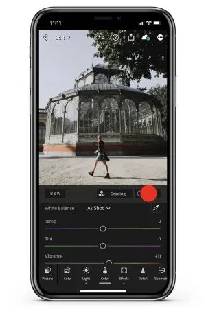
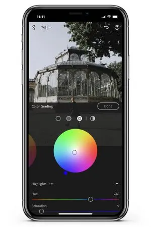
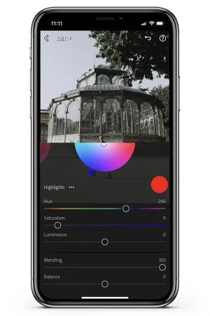
- Add more color, click on Grading (top right in Color tab, left to Mix)
We previously only edited colors that were already in the photo. This Grading section actually adds color that wasn’t in the photo before!
Where the White Balance affects the entire image (and only has the 4 colors to choose), in the Grading tab you can add any color you want, how saturated you want, to the shadows, mid-tones, highlights, or ‘global’ = your entire image (whoah – all the options). Play around to see what it does!
GOOD TO KNOW: Grading was previously Split Toning in Lightroom.
For this preset, we’re only going to add color to the highlights (third dot/circle from the left). Set Hue 246 and Saturation 9 and Blending to 100 (see photo).

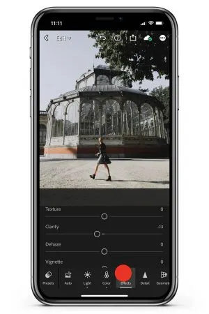
- Edit the effects in the Effects tab.
– This tab is to add certain effects to your photos. This is very specific to create a certain ‘look’ but it can be tricky to have all these settings included in a preset, since it can look beautiful on some photos, and horrible on others.
With these settings, it’s easy to get carried away and use too much. Go easy on this!
– For our edit, we only set the Clarity to -13 to soften the image.

- We are done with our settings, let’s create a preset!
This is an edit I really love and use on many of my photos. I can copy and paste the settings every time, but it’s easier to save the settings in a preset. With a preset, I can apply the same settings easily (1 click) on another photo.
For this tutorial, we are skipping the Detail, Optics, and Crop tab since it’s very specific to each photo, to which camera you used, and in what format you shot. Feel free to experiment with it.
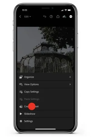
We’re skipping Geometry, Selective, and Healing for now since it’s photo-specific and (in my opinion) should not be included in a preset. And these are ‘premium’ features for people with a Creative Cloud subscription. - Click the three-dot icon in the top right corner
This opens a panel of options.

- Click Create Preset

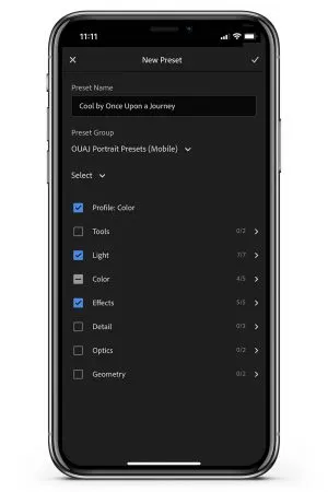
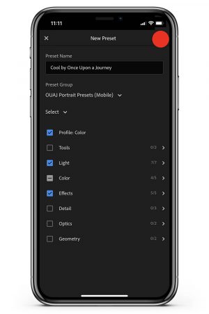
- Create your preset
Name your preset.
Choose a preset group (you can create a new group if you are going to make more presets that you want to bundle). The default group is User Presets.
- Check the tools/categories
We’re going to ‘check’ the tool-categories we used: Profile, Light, Color, and Effects, so all those settings are saved in the preset.
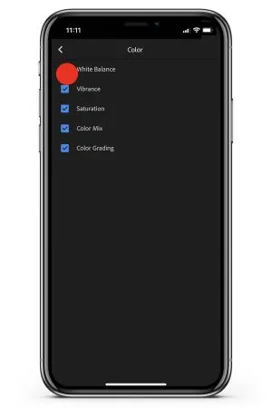
You can also check or uncheck specific tools within the tool-category (click the arrow on the right to open the specific tools within the category). TIP: I prefer to uncheck ‘White Balance’ in ‘Color’.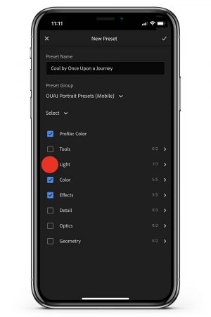

- Click the checkmark on the top right to create your preset
You will get a notification your preset was created.

- If you have a Creative Cloud membership, your presets are automatically synced to the desktop application Lightroom (the one with the same rounded icon as the mobile app)
You can use the preset on both desktop and mobile.
NOTE: the presets are NOT automatically synced to Lightroom Classic.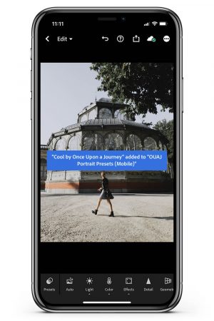

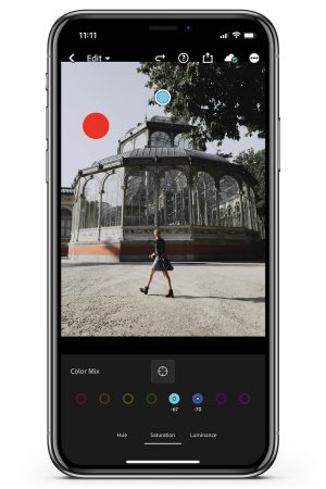
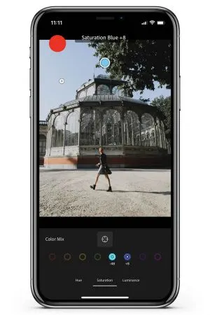
- Make adjustments! I find the colors too muted on this photo, let’s go back into Color Mix.
I want the sky to pop and the sunlight on the ground to be more vibrant.
Tap the target-tool and tap Saturation. Tap on the place you want to increase the saturation in the photo. Tap, hold, and drag your finger up to increase the saturation, or down to decrease it.
In addition, I make the sky a bit darker by selecting Luminance. I tap, hold, and drag my finger down to bring the luminance down. Et voila! I like the result!


- Use the preset on other photos
Open another photo, tab the Presets tab (left in the bottom menu) and apply the preset (you can change preset groups by click on the top).


- Make adjustments.
A preset might look great in one click, but more often, you need to make little changes to the editing. Lighting and colors are different in every photo, so you have to tweak the settings to make it looks best.
Dive into the tools and play around! You can also add more photo-specific tools-categories like Detail, Geometry, Optics, Crop, Selective, and Healing. The function of a preset is to be a base that you can start with! - Practice makes perfect!
The best way to get better is to edit a lot. Presets will help a lot with the process, starting editing from scratch is a LOT. A preset will be a great base and you can go tweak from there. Happy editing!
And that concludes our ‘How to Edit’ Lightroom tutorial! Read on for some FAQ about Lightroom (like: how does the tone curve work?!)!
Editing FAQ
- How can I change one color if I don’t exactly know which color it is?
Sometimes, colors are deceiving. A green leaf may actually be ‘yellow’ or some greens are considered ‘teal’ in Lightroom. You can click the ‘target’ icon to manually select a color in your photo.
You can tap and drag it up or down to increase/decrease the hue, saturation, or luminance (tap the one you want in the bottom menu). Here’s a video where you can see how this works.
- My skin looks weird, help!
Sometimes, you’re a bit too enthusiastic with editing the colors, or maybe the preset you used made for a specific lighting scenario (or a specific skin color), and your skin color doesn’t look good. Let’s fix that!
Skin tones are affected by orange, and usually red, and sometimes yellow. No skin color is the same!
You can use the target tool again in Color Mix to select your skin and adjust the hue, saturation, and luminance. It usually looks great if you desaturate and drop the luminance a bit in the ‘orange’ mix.
- I still don’t get the tone curve – help!
First of all: don’t worry! The tone curve is one of the most advanced tools in Lightroom and I have to admit, that I didn’t get it at all at first.
I have a lot of presets where I didn’t use the individual color curves (red, green, and blue). If you don’t feel comfortable – leave it! The RGB curve is worth playing around with. I usually make an S-curve.
You can make a ‘big S’ as we did in this article or a more subtle S. My best tip is to play around and really look at the photo and see what it does.
You will notice that the curve does a lot of what the highlights, shadows, whites, and blacks do in the Light-tab. Those are essentially a simplified tone curve!
Remember: you don’t HAVE to use all the Lightroom features if you don’t want to!
- Can I remove people from pictures in Lightroom?
Yes, but you need to have a Creative Cloud subscription to use the Healing tab. There, you can select a spot that you want to ‘clean up’ and choose a healing or clone stamp brush.
- If I don’t have an ‘eye’ for what looks good, how do you suggest using the app?
I think presets are a great way to get a certain ‘look’ without having to do all the work yourself. In the end, practice makes perfect. If you edit and analyze more photos, you will realize that you have ideas about what looks good in a photo.
Also, what looks good in my opinion might look horrible in someone else’s and vice versa. Photo editing is a form of expression, a form of art! You do you!
- How to get light dreamy and soft photos?
There is a lot editing can do, but never forget that your actual photos will determine a lot of the look of your photos. Dreamy and soft photos are often made with special lenses – like portrait-mode on iPhone!
Photographing in soft light (sunrise and sunset) helps too. In the editing, you can soften an image by decreasing the contrast (in the Light tab and Effects, with Clarity). You can make edits dreamy by adding dreamy colors (pinks for example) with the Grading tool.
- How to make a subject stand out (without affecting the background too much)?
First of all, I would think about this while taking the picture. But if you already have a photo you want to work with, you can make a subject stand out in the Selective tab (subscription-only).
With the brush, radial, or gradient tool, you can select the subject and change things with the Light, Color, Effects, Detail, and Optics tab. You can, for example, use the tools to blur the background (with sharpening).
HAPPY EDITING! Share your creations with #onceuponapreset to get featured!
If you have any further questions on how to edit, Lightroom, or anything else regarding editing, leave a comment below and we’ll get back to you.
For more editing tips and tutorials make sure to follow @onceuponajourney and @onceuponapreset.
PIN THIS ARTICLE

